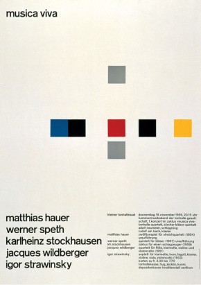
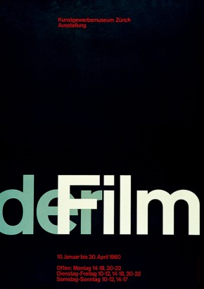
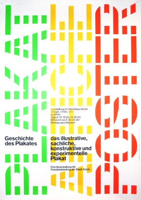
Josef Muller Brockmann - grid-based layout and web design
From my archive - originally published on 13 March 2010
Josef Müller Brockmann condensed design elements to focus on a core message with a clean and clear visual aesthetic. What does this have to do with software development? More than you might think, actually…
Simplicity and clarity isn’t just for visual designers as developers and architects should also try and achieve clear designs that focus on a set of core messages. A well-designed architecture will arrange independent components in an orchestration that has a certain clarity and symmetry to it, pretty much like one of Müller Brockmann’s posters. There will be well-defined relationships between each element. Nothing will be added unless it’s really required. The overall purpose will be clear.


In an agency-style environment the focus is on the user experience and the development process is set up to ensure that coders don’t have to make aesthetic decisions. This separation between design and development helps to protect the consistency of a designer’s work as it gets translated into an application. It also serves to create a mutual ignorance where designers are technically naive and developers are aesthetically ignorant.
It’s not often that practical to organize the separation of concerns between design and development that you would expect to find in a digital agency. Sometimes you just have to muck in and tart something up. There are a lot of horrible looking interfaces out there produced by development teams who have no idea about basic design aesthetics.
A rudimentary understanding of some graphic design techniques can really help here. A key part of Müller Brockmann’s approach involved the use of the typographic grid. This involved dividing space up into a number of consistent horizontal and vertical units, each with consistent spacing between them. The grid is used to define the constant dimensions of the design space and elements are inserted precisely into it.
Müller Brockmann said that a grid system creates a “sense of compact planning, intelligibility and clarity, and suggests orderliness of design” (Grid systems in graphic design, 1981). The objective here is usability: information presented this way is not only read more quickly and easily, but is also more easily understood and retained in memory.
This kind of methodical design system appeals to developers. The tools and languages lend themselves to organizing elements into a grid. On a rudimentary level it provides a rule-based system of design that can help you to lay elements out in a design that is both useful and pleasant to the eye.
You’d be surprised how many amateur designers there are lurking in development teams. Given that everybody’s supposed to be learning to code these days, isn’t it time that developers learnt a little bit about design too?


